Overview
Client: School Project (Non-client)
Role: UX Designer, Branding
Scope: Research, Information Architecture, Wireframing, UI Design, Branding, IxD, Prototyping, Testing,
Time: ~ 180 hours
Tools: Figma, Google Suite, Google Meet, Optimal Workshop, Calendly, Maze, Pen & Paper


UX Research Plan
Goals & Objectives
-
Know the competition and the industry best practices.
-
Learn the market’s perception of time travel, their views, behaviors, & emotions at a granular level.
-
Determine what steps people take when deciding to embark on a new type of journey.
Methodologies




Responsive
Next, I made all the screens responsive to desktop, tablet, and mobile screens
Findings:










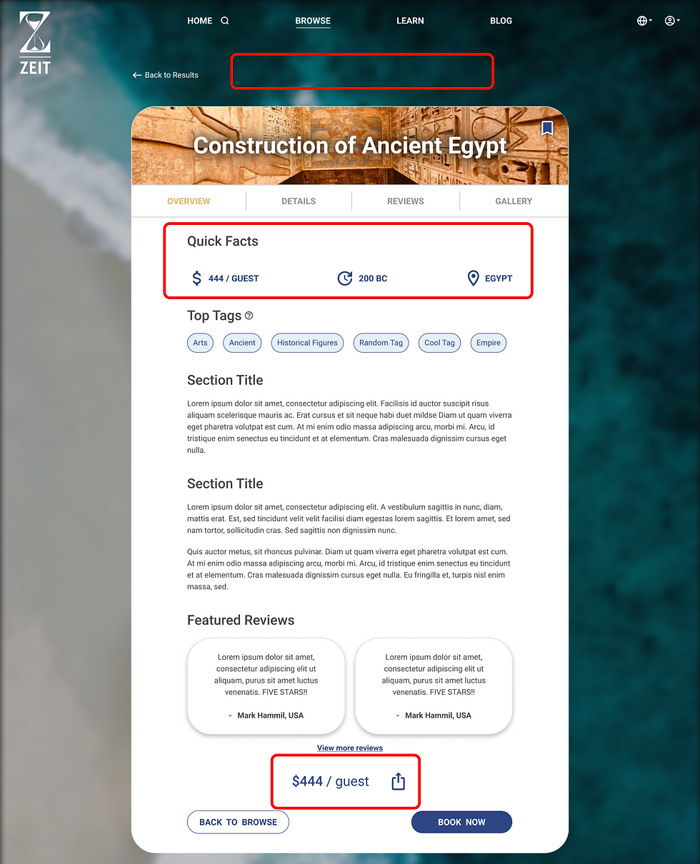
2 - Booking Details Redesign
-
CTA “Book Now” moved to top of screen.
-
“Quick Facts” info viewable in every tab.
-
Overview sections rearranged to flow more naturally.
-
Less empty space at top of webpage, allowing users to see more without scrolling.
Original (V1)
Redesign (V2)

Iterations (2)
1 - Search (Easier & Simpler)
-
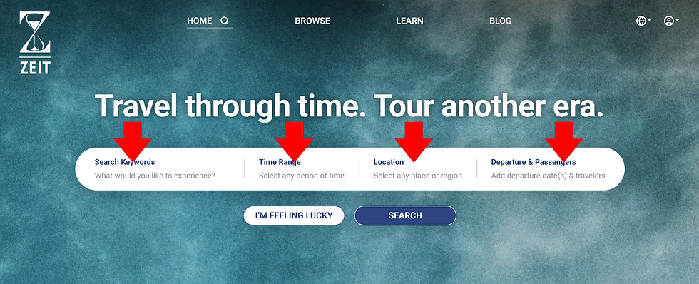
"Quick Search" is the new default search option, with a simple keywords bar.
-
"Advanced Search" is now optional, allowing for regular users who want more refinement to their search to use it if they choose.
-
Since my data indicated that most users would be exploring or discovering during their time on the site (rather than booking a trip), the omission of departures and passengers in the "advanced Search" would provides a cleaner experience, reducing clutter. (filters still listed in filter dropdown)
Original
V2 - Advanced Search

V2 - Quick Search

Background
Zeit is a hypothetical subsidiary of Virgin Galactic, founded by Sir Richard Branson. In this imagined reality, the company (Zeit) made a breakthrough discovery in time-travel technology.
Zeit wants to monetize their discovery. They hope to turn time travel into the next hot tourism method.
The Problem
A New Sub-Industry
Zeit wanted to turn time travel into the next hot tourism method. Zeit had a lot of assumptions about the market and its potential buyers, but lacked real world data validating their business approach, nor did they have any data to guide their UX design decisions.
Zeit needed answers.
Zeit needed validation.
Zeit needed design direction.
The Solution
A responsive booking website where users can explore, be inspired, and book trips to any destination in time on Earth. At just a glance, users can gather key insights about a destination using quick facts, and Zeit provides transparent and easy to digest information about the science and safety measures for time travel.
Secondary Research & SWOT
I conducted SWOT/competitor analyses of potential competitors:
This was important to me because I wanted be fully aware of what companies Zeit was up against and would it would take to get/keep Zeit at the top.
Interviews
I interviewed 6 individuals from various backgrounds to understand their views, behaviors, and thought processes.
Card Sorting (IA)
Setup
I wanted to to learn how users group information together (for IA purposes). I used 20 cards, each one listing a destination name and other details.
Biggest Observation
In my study, only 60% finished the card sort. I deduced that users -- particularly those who bounced -- are not confident in their knowledge of dates and events (a bug part of the exercise). This was a big find from between the lines because my original assumption was that people would want to search first by time or era.
Takeaway
The case for a design that used "time" or "time periods" as the primary method of search or categorization was toppled. I would need to make navigation & search functions VERY easy.
Persona
Persona
From the user interviews (and secondary research), I observed some common patterns of goals, motivations, pains and frustrations with regards to travel (especially with hypothetical time travel). This persona reflects those summarized findings. I added additional demographics and assumptions to further humanize the persona.
Empathy Map
I mapped out my research findings onto “Matt's” empathy map to help me better visualize and understand the user's thoughts and feelings, helping me to empathize with the user during the design process.
Project Goals
While I'm first and foremost an advocate for the user, knowing and understanding business goals and technical constraints is just as important when designing something new. I created a chart showing each of those areas, as well as where they all merged and came together. In the end, it's all connected; it all matters.
Information Architecture (IA)
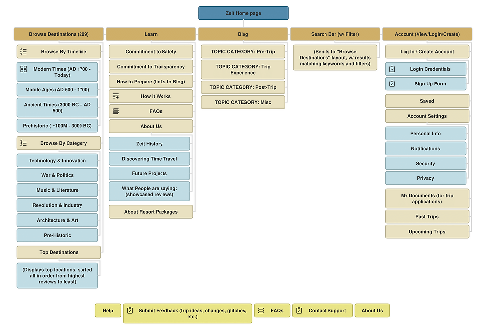
Using my findings from the card sort activity and user interviews, I created this sitemap. The sitemap also proved helpful in defining user flows and task flows.
Flows
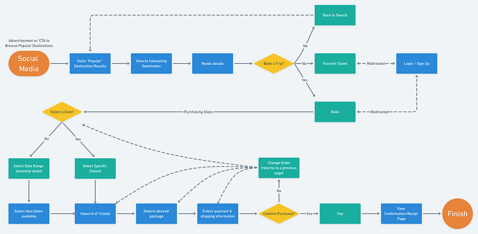
Referencing the sitemap, I was able to define what a user flow would look like if they were to click on an advertisement from social media. Next, I created a task flow for making a purchase.
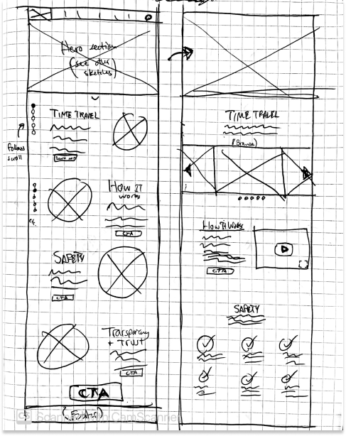
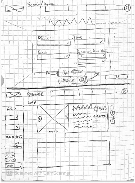
Wireframe Sketches
Because of my SWOT analysis, I was able to generate ideas for the hero section, search, tiles, and other pages while catering to the specific needs of my users (based on persona).
Logo
Sketching
After browsing the internet for images related to key terms I wanted associated with the brand (e.g. time, high-class, clean, precision, travel, trustworthy, etc.), I started brainstorming on paper potential logos.
Logo Selection
I chose the hourglass sketch as I felt it symbolized Zeit’s offering well and presented a clean, balanced design.
Color Choice
I originally fell in love with the 2-tone design (blue & yellow). But ultimately, I decided a mono-colored logo would be more versatile and work better for visibility when working with various background colors and marketing content. (last image)
Mid-Fi Wireframes
Taking everything learned and defined up to this point, I transformed my sketches into mid-fidelity wireframes. I started with the essential screens from my user flow for the MVP. Columns of notes were added beside each section with an explanation backing my design decisions.
Hi-Fi Wireframes
I applied my style guide (created before this step) to the new, hi-fi wireframes. Because I've found it easier in the past to scale down rather than up, I started with the desktop screens and then moved towards mobile later. (mobiles not shown here)
Usability Test
The Test
Using Maze, I tested the prototype with 16 participants. Mis-click rate was 8%, and avg. direct success was 50%. While nearly half were able to succeed at the tasks the 1st time, there were clearly some design issues I needed to look at.
Affinity Map & Priority Matrix
From the test results, I was able to categorize and map out all of the takeaways. Blue notes were related to task 1: complete a search. Orange notes were for task 2: book a trip. After listing all of the findings, I summarized them into solutions and prioritized them using a priority matrix.
Final Thoughts
Next Steps
This was a hypothetical project, but if it were for a real company, these would be my next steps:Iterate
-
Test
-
Iterate
-
Repeat (until a high direct success rate is achieved)
-
Complete same process for Mobile versions
Project Reflection
-
Branding - logo versatility matters. Make sure logos work in a variety of settings.
-
Colors - Make sure your screen is color accurate (and your eyes, too). Color palette critique should be included in the process, or you may find out halfway through that you have a dirty lime color instead of the intended gold. (fixed my screen, btw)
-
Dark/Light Mode - Something I would do different is my approach to the dark theme. The tiles and destination details components don't feel as endemic to the rest of the website as I'd like due to the contrast. I would want to see them meet together a little nicer. To do this, I'd start by playing with off-white alternatives.

