2 - Removed “Related Jurisdiction”
This radio button was a point of confusion to nearly every user. After a value analysis, I realized simply removing it was the best choice. It just wasn’t an addition that added value to users on either end. If desired, the selected topic could help determine this in the backend in a future version.
3 - “Track Your Idea”
Users can stay in the loop by being updated. This would help users feel that their contribution matters more and that it’s not just being sent off into some random corner of the internet.
4 - “What to Expect”
Users will now be reminded of the process, how it works, and what to expect next. By including this collapsible section, users won’t feel “left hanging” (as expressed in previous tests) and will instead feel a greater sense of completion on their end and follow-up on the other end.
5 - Added “Services” Links
I wanted to give users an easy jumping-off-point from the submission page. Now, they can easily transition to another service on Utah.gov in one click by selecting a desired services at the bottom. (They’ll still have “related links” in the right pane.)


-WEBP.png)

Before (V1)
After (V2)

Before (V1)

After (V2)

Iterations 3, 4, & 5 (Additions)



Overview
Client: Non-Client (independent project w/ mentorship)
Role: UX Designer
Scope: Research, Wireframing, UI Design, Prototyping, Testing
Time: ~ 80 hours
Tools: Figma, Google Suite, Google Meet, Calendly, Pen & Paper
Background
"Add a Feature"
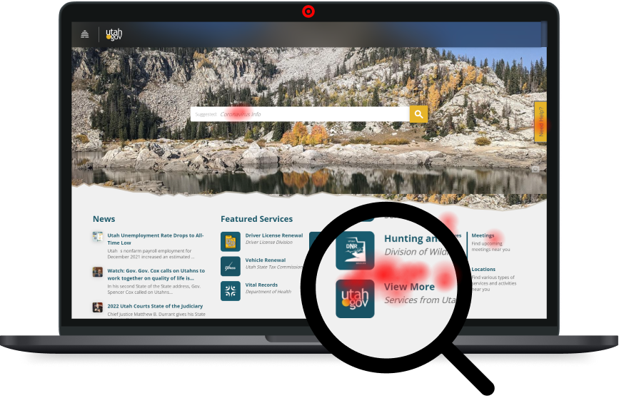
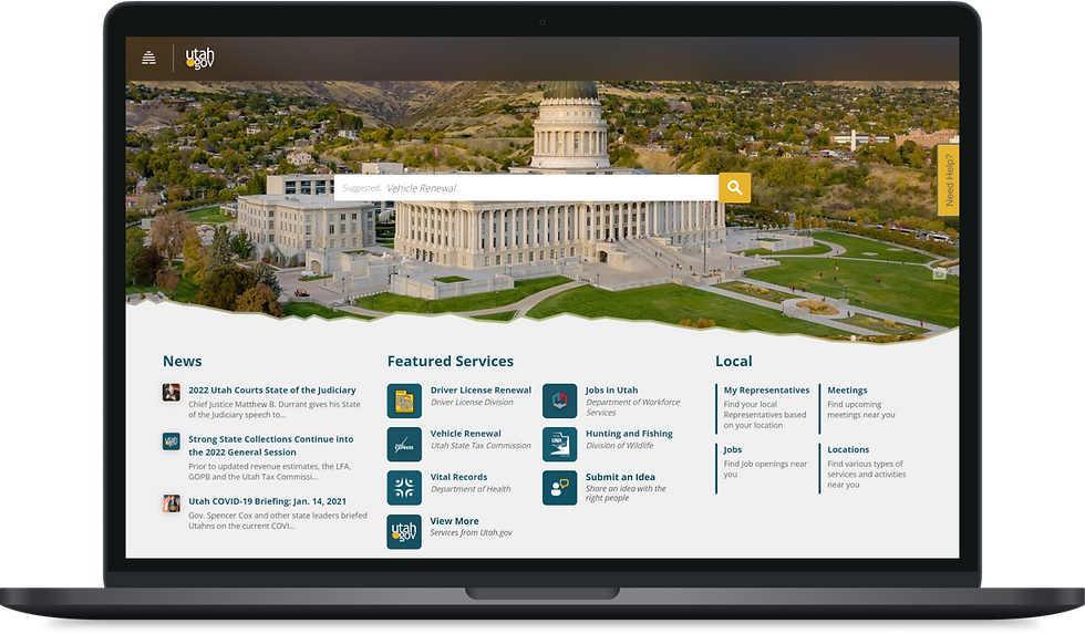
For a capstone project, I selected a resident-facing government website (Utah.gov) to analyze and identify a problem. Once identified, I added a feature that solved that problem, making sure it felt endemic to the existing UI (not a redesign, but a feature add).
Observation
Historically, state and local government websites tend to lag behind in adoption of new UX strategies and adding needed features. Utah.gov appears to have broken part of this stereotype by doing a full update of their website UI, interactions, and overall usability and accessibility. But, even so, there's plenty of room for improvement.
The Problem
Citizens want to be involved & and help their government(s) with their ideas/solutions, but most don't know how or where to submit them, nor to whom it should be submitted, and they aren't confident their idea would get looked at in the first place.
The Solution
A webpage form that is easy to find, easy to fill out, and gets the message to the right people in the right government level, department, and position, all while instilling confidence in the user that their submission will be looked at.
Secondary Research
Competitive Analysis
I analyzed 5 government websites (city and state) here're are some of my takeaways:
-
Attachments crosses red tape on some websites, posing a security threat (e.g. virus). Other sites allow it with reCAPTCHA.
-
"Find your representatives" sounded helpful, but usually amounted to more clicking, exploring, and link hopping.
-
Search bar results were not as helpful because they usually just showed embedded Google results rather than answers.
-
Excessive required clicks was a common theme across all sites in order to get to anything. (that's bad)
-
Anonymity is an allowed option for most government sites., but some still require personal info.
Provisional Personas
I created 5 provisional personas (temporary) to give me something to go off of when preparing my surveys and interview guide: 1) The Solver, 2) the Complainer, 3) the Activist, 4) the Idealist, and 5) the Businessman. (click image below to see more)
Methodologies
Part 1: Survey
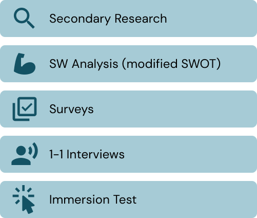
Using my research findings, I created a survey in Google Forms to capture quantitative and qualitative data from my user audience. Participants were screened to ensure answers were provided by US citizens.
Part 2: Interview
Using my survey results, I created an interview guide with questions that dove deeper into my observations. I conducted the interviews via Google Meet to gain as much insight as possible.
Part 3: Immersion Test
At the end of each interview, I had each interviewee share their screen and walk me through how they would accomplish a series of tasks on Utah.gov. Their actions, reactions, and expressed thoughts were recorded.
Key Findings
1 - Form Preferences & Behavior
Learned how users would expect a form to behave, their preferences, dislikes, and how they themselves would behave given certain scenarios.
2 - Civic Engagement
I learned of past experiences users had with participating civically in their communities and states, their expectations, frustrations, and even their reasons behind being apathetic in certain situations.
3 - Web Interaction
I learned what key elements and features would be needed in order to create a good end-to-end UX experience with an idea submission form feature.
Personas
Time Crunch
Due to an unforeseen calendar event (a federal holiday), I lost an entire day of work in my tight timeline. Rather than pushing my original deadline back or skipping this step, I used a template from the Figma community. That cut my expected time for this step in half.
Personas
Persona 1: Layla Wilson (43)
Persona 2: Conner Kotter (27)
Persona 3: Hannah Prisby (23)
While their backgrounds are diverse from each other, they still each share a common goal: to have their ideas and concerns be heard, acknowledged, and considered.
User Flows
Using my findings and personas, I defined what a main user flow would look like. This flow guided my information architecture and wireframing decisions.
Sketches
Crazy 8's
I used timed “Crazy 8’s” drills to help me ideate and explore solutions for:
-
Form structure
-
Overall Layout
-
Feature link placement (for easy navigation)
-
User flow
Once I had some variety of ideas from my sketching, I recreated them in Figma (Lo-Fi) so I could re-arrange elements and create new variations quickly and easily.
Lo-Fi Testing
A/B Test
I created 2 rough prototypes for each variation I was leaning towards. I ran a quick gut test of both with 1 user to see which prototype they preferred and had a better experience with.
Results
The user expressed vastly more reasons for liking Variation B, among those being that it was broken down into easy steps, rather than everything at once on one long page (which was overwhelming). From there, I decided to focus on developing Variation B.
Hi-Fi Wireframes
Lo-Fi → Hi-Fi
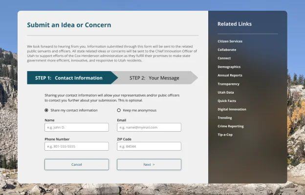
After making a few changes to the variation B I had tested, I applied the existing branding and UI style and made the added feature blend in well with the existing Utah.gov website.
Time Savings: IxD
Thanks to previous time savings efforts (see personas), I decided to take extra care into my Interaction Design (IxD), making all elements and components interact as realistic as possible with users.
Usability Test
Affinity Map
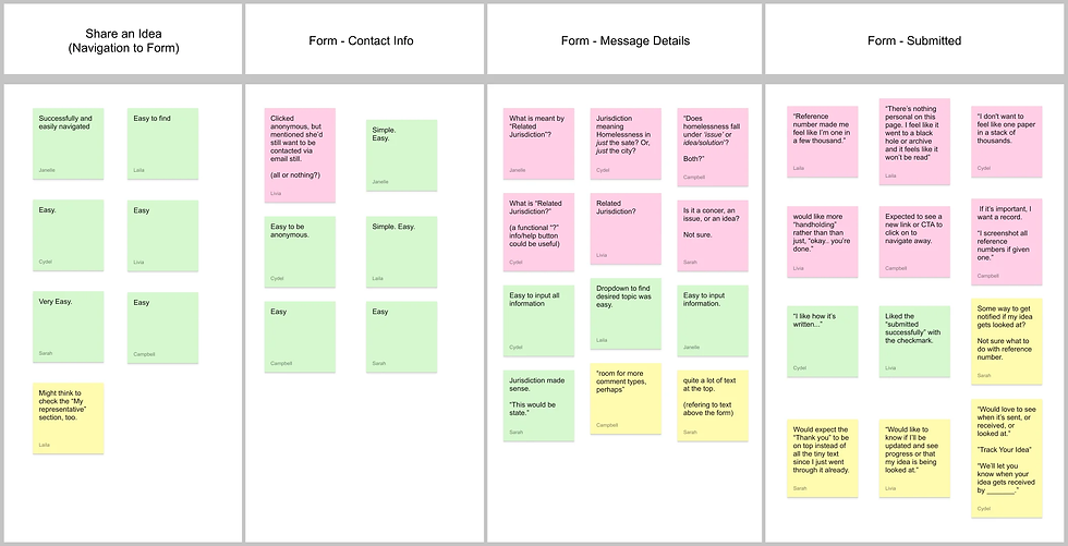
After my usability tests, I aggregated the takeaways and findings in this Affinity Map, placing notes on green, pink, or yellow cards depending on their nature (positive, negative, or suggestion/other).
Priority Matrix
I summarized and ranked my findings in a priority matrix to help me determine which iterations should be worked on first. I always begin with the “Easy Wins” (High Impact, Low Effort).
Observations
After studying my affinity map, I determined what main additions, changes, or omissions needed to be made. This included:
-
"Search/Filters" simplified and flow improved
-
"Plan" screen sub-navigation redesigned
-
"Activity Details" kinks worked out and overlooked elements enhanced
-
Making various components more obvious across pages/screens (e.g. chat box)
Iterations (5)
1 - Text Field Clarification
I made required and optional fields more obvious to the users to eliminate any doubt as to what they can skip and what they can’t.
UX Research Plan
Goal
Discover the best possible feature solution to address the problems/challenges that proactive citizens face (i.e. confidence in getting their voice heard).
Research Plan Outline:
-
Problem
-
Research Goal
-
Objectives
-
Key Questions
-
Methodologies
-
Target Audience
-
Assumptions or Risks
Methodologies

Final Thoughts
Next Steps
Had this project continued beyond this point (and the state of Utah were my actual client), here’s what my next steps would have been:
-
Test New Prototype (V3)
-
Iterate
-
Repeat until goal success rate is achieved
-
Finalize Design
-
Hand-off
Reflection
There may be a lot of red-tape in designing government related websites (especially public facing ones). But as a proponent of users, UX designers can still work with governments to provide excellent user experiences. Clear communication and upfront conversations about constraints (e.g. "red-tape") will be important to any regulated or public project, especially in the beginning stages.
Latest Prototype
Ideally, I might have more rounds of testing and iterations. But, this project had a planned end date that had come. Below is a recorded demo of the latest prototype. (best viewing experience on desktop)


-2.png)

-1.png)
-2.png)
-3.png)


