Overview
Client: Myself (personal business venture)
Role: UX Designer, Group Facilitator
Time: ~ 90 hours
Scope: Research, Facilitating, Information Architecture, Wireframing, UI Design, Branding, IxD, Prototyping, Testing
Tools: Figma, Google Suite, Zoom, Calendly, Pen & Paper

UX Research Plan
Goal
Discover the needs, wants, desires people have for their relationships and uncover potential solutions that could enrich their relationships and personal lives.
Research Plan Outline
-
Problem
-
Background
-
Research Goal
-
Objectives
-
Questions
-
Methodologies
-
Target Audience
-
Assumptions or Risks
-
Timeline
Methodologies


.png)


Background
The modern American family spends increasingly less quality time together throughout the week, and quantitative research shows that parents and kids alike want more quality bonding time. This isn’t unique to families, but couples too (married or unmarried). Quality time together is a crucial part of relationship building, and we aren't getting enough of it.
Quality time together is a crucial part of relationship building, and we aren't getting enough of it. Research shows that parents and kids alike want more quality bonding time, and yet data is showing that American families are spending increasingly less quality time together throughout the week. This isn’t unique to families, but couples too (married or unmarried).
The Problem
How can parents, kids, couples, and individuals more easily achieve quality time together (or alone) in an increasingly busy world, where schedule-driven lifestyles have become a necessity?
The Solution
A mobile application where people can discover, collaborate, and plan activities with their respective groups seamlessly from one app.
Secondary Research
After researching a variety of related topics about families, couples, and well-being, I documented & cited my findings. Here are my biggest takeaways.
Families
-
73% of American kids would like more opportunities to bond with their family & 70% of parents would like more chances to spend quality time together. (Finding time or making time has been a roadblock for almost all)
Quality Time
-
Strengthens bonds, intimacy, and builds trust
-
Improves academic performance (especially in kids)
-
Builds resolution skills, and can reduce/prevent behavioral problems
Trying New Things
-
Improves well-being in 4 domains: Physical, Mental, Relational, Spiritual
-
Creates new neurons and neural connections, also creating satisfying new memories.
-
Fear takes a backseat and your sense of adventure grows
SWOT Analysis
I identified 7 potential competitors (6 apps, 1 non-app) and conducted a SWOT analysis of each.
Highlights
-
Many were limited in their activities offering, focusing on location based activities only
-
Many were limited to paid activities only (or simply less at home or free stuff)
-
Some had easy search and filter for discovering activities
-
Very few allowed you to add other users to your group & match activities
-
Very few offered fresh ideas for activities (same old things, or paid/promoted activities)
-
None were crowd-sourced, thus limiting their options and growth (high growth opportunity)
-
None had Google/Apple Calendar integration for quick & easy group scheduling
Provisional Personas
3 Subject Groups
I noticed that most of the data I found surrounded 3 groups of people:
-
Couples
-
Parents
-
Kids
So, I made the decision to base my provisional personas on just these for the MVP. The purpose of these provisional personas was to give myself a quick reference as I prepared for my 1-on-1 interviews.
Interviews
Because of my findings from previous research and analysis, I was able to determine what questions still needed answers and what direction to take my interviews.
Key Findings
-
Quality time means undistracted time to connect.
-
Spontaneous and planned activities are equally desired during the week, but often planning is a need.
-
People usually consider the same list of things each time planning an activity or date night.
-
Trying new things is fun, but familiar things are usually planned because it’s less work.
-
People research new things to do using: Google Search, social platforms, blogs, & Alltrails (outdoors).
-
People want to know a regular list of things about the activity before committing to doing it. (e.g. activity level, weather, gear/supplies needed, cost, and more)
-
Calendar integration/syncing, reminders, weather monitoring were all things that participants suggested being very desirable in the planning stage of any activity.

Personas
3 Subject Groups
Most of the data found during my research surrounded 3 groups of people:
-
Couples
-
Parents
-
Kids
MVP: Narrowing the Focus
Using qualitative data gain from interviews and secondary research, I created 2 personas:
Persona 1: The Young Couple (Jessica Meyer)
Persona 2: The Parents (Tim Gregory)
While “kids” would make a good 3rd persona, I decided against it for this first MVP because I wanted to focus on just parents and couples since I hadn’t interviewed any kids at this point. I also wanted a narrower focus.
Business Model Canvas (BMC)
I would use these personas as customer profile(s) and then define customer segments as: 1) Parents, 2) Couples, 3) Kids, and 4) Friends Groups. Friend Groups, while important for the growth of the app (crowd-sourcing), isn’t suitable for this first MVP since there’s less data I can rely on. Will consider later.
Product Roadmap
Taking my findings, I made a list of features that could satisfy the needs, goals, and frustrations of my personas.
Prioritization Method
-
Added Feature Name
-
Added Feature Description
-
Included Reference Supporting Research
-
Allocated "Importance Points" (1-5)
Ranking
Features were ranked by points and then grouped into priority levels (P1 - P4, P1 being the highest).
Adaptability is Important
Knowing the UX process can be fluid and roadmaps can change, having an excel sheet where I can easily shift priorities with just a few clicks is helpful. Design is always a work in progress, so it’s okay if attention and priorities need to shift occasionally. Aged priorities can be tackled later.
Sitemap (IA)
After the research, analyses, personas, roadmap, I was able to develop this Information Architecture (IA) intuitively. Several iterations later, I decided to go with this IA (shown below) because I felt it had the more intuitive flow and grouping.
Task Flows
Using my findings and personas, I defined 3 main task flows for the users:
-
Sign In/ Signup
-
Favorite an Activity
-
Plan an Activity
Always a Work in Progress
These flows would see additional refining and modifications as I designed my Mid-Fi’s and Hi-Fi’s.
Ideation Session: Facilitating Crazy 8’s
Session
After giving a brief background on the project (e.g. research findings, conclusions, etc.), I shared with the participants a persona highlighting the problems & goals at hand. I explained the exercise (Crazy 8’s) and how it should go. Once sketches were done, I had each participant present their ideas to the group, as I recorded the group’s sentiments and preferences towards each solution.
Stakeholder Participation
Ideation sessions are a great opportunity for stakeholders to have a say in the UX process. By presenting to them the data, pains, and goals, and then having them help in the ideation of new solutions, the stakeholder gets a taste of the process and become advocates of the process down the road.
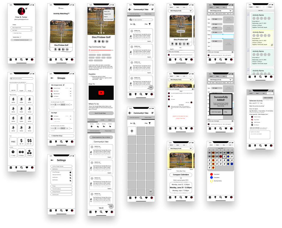
Mid-Fi Wireframes
By conducting the group Crazy 8’s session, I was able to quickly start on several potential solutions.
The results from the group exercise influenced the rest of my mid-fi wireframes.
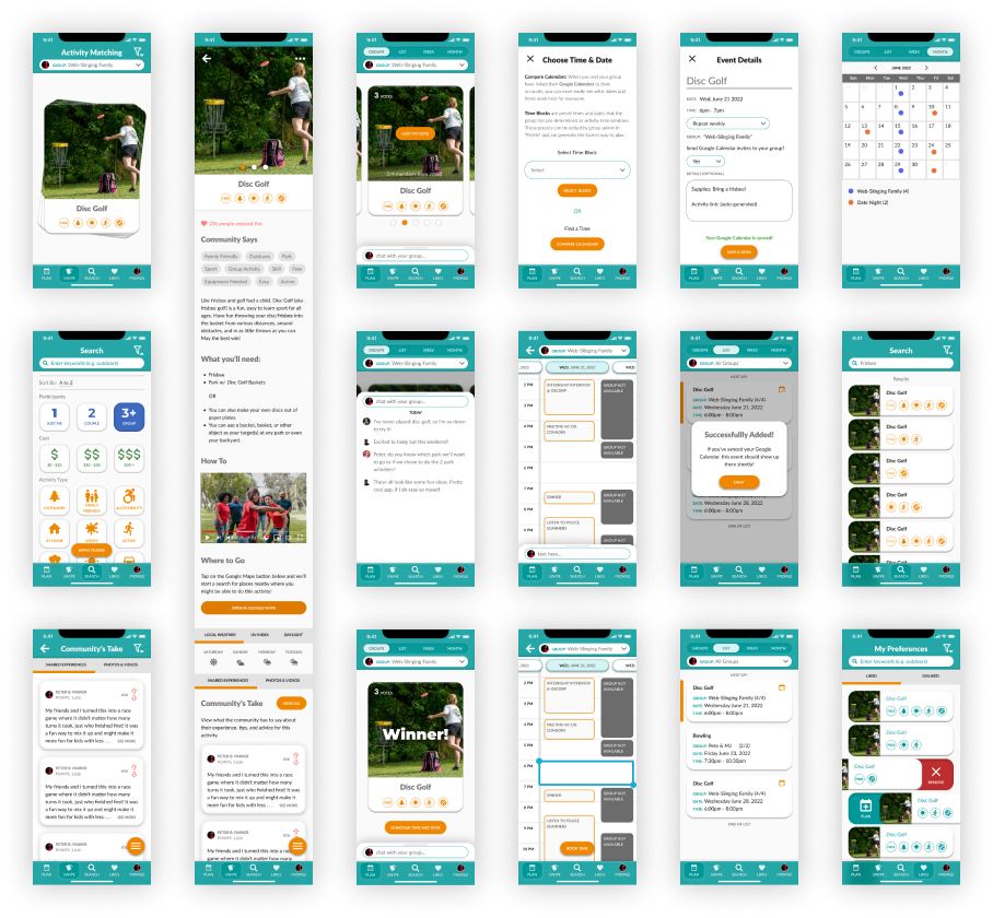
Hi-Fi Wireframes
From Mid-Fi to Hi-Fi
Having started with a mid-fi wireframes, sharpening the components and applying a style guide was simpler, easier, and faster.
Prototyping Interactions
Working on prototyping simultaneously helped guide my design decisions and filled in any would-be design-gaps.
Usability Tests
Affinity Map
Using my MVP (majority of main features fully designed), I tested its usability with 3 testers. I then aggregated the takeaways and findings in this Affinity Map.
Priority Matrix
Observations
After studying my affinity map, I determined what main additions, changes, or removals needed to be made. This included:
-
"Search/Filters" simplified and flow improved
-
"Plan" screen sub-navigation redesigned
-
"Activity Details" kinks worked out and overlooked elements enhanced
-
Making various components more obvious across pages/screens (e.g. chat box)
Priority Matrix
I prioritized the features/changes using a 4-quadrant matrix.
Iterations (7)
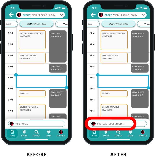
1 - Chat Box
-
BEFORE: Chat Box is obvious at bottom, but users didn’t know what it was for.
-
AFTER: Chat Box has pre-filled text indicating that it’s for chatting and coordinating with your group.
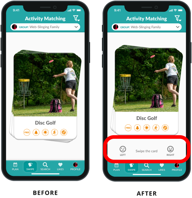
2 - Swipe Instructions
-
BEFORE: Activity Match screen (swiping) showed cards, but no swiping indicator nor instructions.
-
AFTER: Screen has instructions below the cards, helping users unfamiliar with swiping know what to do. (onboardings tutorial will also be added later)
3 - Start Search
-
BEFORE: When tapping “search” navigation option, they navigate to the filter screen to begin the search (which was confusing to users).
-
AFTER: To avoid confusion and provide a fresher start, the initial search screen now shows up clean (filters collapsed) and only shows a daily quote about trying new things, quality time, etc.
4 - Filter Change
-
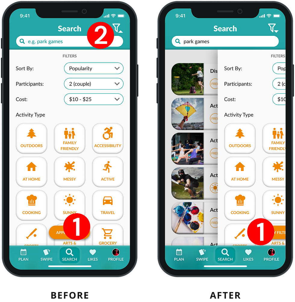
BEFORE: Filters were bulky, some were unnecessarily large, and users didn’t like having to scroll quite as much.
-
AFTER: Some filters were replaced with a dropdown instead of a tile (for compactness), and activity related tiles tiles were shrunk down marginally. (to be tested again)
5 - Filter Interactions
-
BEFORE: After applying the filters, the user should close the filter screen to see updated results. (2 taps)
-
AFTER: Filter screen now automatically closes after being applied and user sees updated results immediately. (1 tap)
6 - Upvote
-
BEFORE: Community comments used an icon of a hand holding a heart, meant to indicate a way to “thank” or “appreciate” the member for their advice or contribution.
-
AFTER: Ambiguous icon was replaced with an upvote/downvote icon to make it clear and simple for users. (no ambiguity).
7 - Sub Navigation Tabs
-
BEFORE: Users thought the sub-navigation options in “plan” felt unrelated to “Groups” (poorly named), and overall felt strange. (Groups, List, Week, Month).
-
AFTER: Re-worded and simplified sub-navigation to make more sense and feel more complimentary to the task at hand: Planning. (Planner, Upcoming, This Month)
Final Thoughts
I found this project to be quite fun because I personally would love to use an app like this for discovering new activities! Beyond this MVP, I’m interested in seeing this app to fruition eventually and testing it on a larger scale (app store).
Group Facilitation
This was my first time facilitating a virtual ideation session (Crazy 8’s). It took longer than I had expected to explain things due to the many late-comers. There were also some detours in conversation I didn’t foresee, which delayed start times. Next time, I’ll have a better handle on managing conversations, punctuality expectations, and educating individuals pre-meeting about the activity (e.g. instructional video) so that confusion is eliminated and time commitments are kept. :)
Future Design Opportunities
-
Create Activities - allow users to add activities to the database (crowd-sourcing)
-
Filters - Refine and add to the list of activity filters
-
Integrated Map - Consider a fully integrated map instead of the MVP link to Google Maps.
-
Notifications - More customized notification experience (e.g. weather updates for outdoor activities)
-
Larger Scale Testing - After several rounds of iterations and testing, test it on a larger scale through the TestFlight developer app (iOS).


.png)


_COMPRESSED.jpg)
